Introduction
Color has the power to completely transform a space before a single piece of furniture is added. It influences mood, affects perception, shapes first impressions, and creates the overall atmosphere of a home. That’s why choosing the right interior design color schemes is one of the most important decisions you’ll make during any decorating or renovation project.
A beautifully designed room rarely depends on expensive furniture alone. More often, it succeeds because the colors work together harmoniously. The right palette can make a small room feel larger, a dark room feel brighter, and an ordinary space feel professionally designed.
Whether you’re decorating a new home, updating a single room, or planning a complete renovation, understanding interior design color schemes helps you create spaces that feel balanced, inviting, and timeless. This guide explores color theory, popular palettes, room-specific recommendations, emerging trends, and practical techniques that designers use to create cohesive interiors.
Understanding Interior Design Color Schemes
What Is a Color Scheme?
Definition:
Interior design color schemes refer to carefully selected combinations of colors used throughout a space to create visual harmony, balance, and emotional impact.
Rather than choosing colors randomly, designers build palettes that work together strategically.
A successful color scheme considers:
- Walls
- Flooring
- Furniture
- Textiles
- Decorative accessories
- Lighting conditions
Why Color Matters in Interior Design
Color affects more than appearance.
It influences:
- Mood
- Energy levels
- Comfort
- Perceived room size
- Natural light reflection
Because of this, color selection plays a major role in the overall success of an interior space.
Basic Color Theory Every Homeowner Should Know
Primary Colors
The foundation of all color palettes begins with:
- Red
- Blue
- Yellow
These colors combine to create secondary and tertiary colors.
Secondary Colors
Secondary colors include:
- Green
- Orange
- Purple
These emerge when primary colors are mixed.
Warm vs Cool Colors
Warm colors include:
- Red
- Orange
- Yellow
Cool colors include:
- Blue
- Green
- Violet
Warm tones create energy and intimacy, while cool tones promote calmness and relaxation.
Neutral Colors
Neutrals remain essential in modern interiors.
Popular neutrals include:
- White
- Cream
- Beige
- Gray
- Greige
- Taupe
These colors provide flexibility and timeless appeal.
Popular Interior Design Color Schemes
Monochromatic Color Schemes
Definition:
A monochromatic palette uses varying shades, tints, and tones of a single color.
Advantages:
- Sophisticated appearance
- Easy coordination
- Calm atmosphere
Example:
- Light blue walls
- Medium blue upholstery
- Dark navy accents
Analogous Color Schemes
Analogous palettes use neighboring colors on the color wheel.
Examples:
- Blue, blue-green, green
- Yellow, yellow-orange, orange
Benefits:
- Natural harmony
- Soft transitions
- Relaxed environments
Complementary Color Schemes
Complementary colors sit opposite each other on the color wheel.
Examples:
- Blue and orange
- Green and red
- Yellow and purple
Benefits:
- Strong contrast
- Visual excitement
- Dynamic spaces
Triadic Color Schemes
Triadic palettes use three evenly spaced colors.
Examples:
- Blue, red, yellow
- Green, orange, violet
These schemes create vibrant yet balanced interiors.
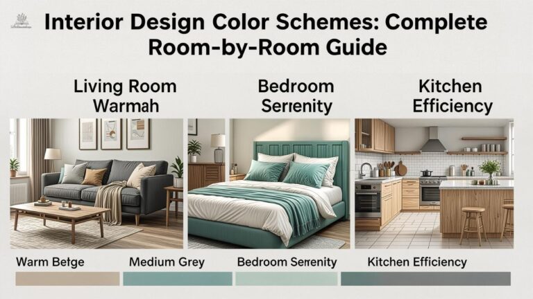
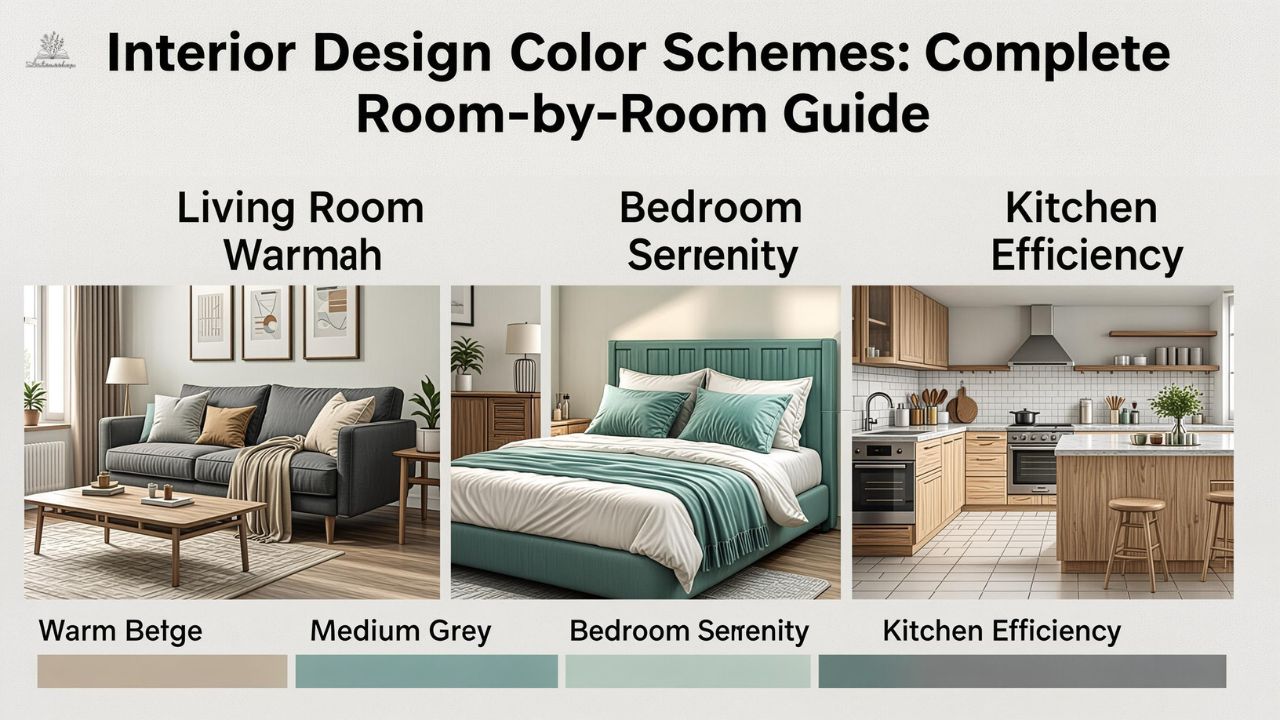
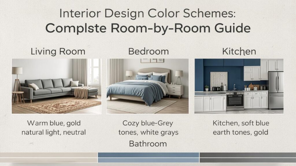
Interior Design Color Schemes for Living Rooms
Warm and Inviting Neutrals
Many homeowners prefer neutral living rooms because they feel timeless.
Popular combinations include:
- Warm white
- Beige
- Taupe
- Soft brown
These colors pair well with nearly any decorating style.
Modern Gray and Blue
A gray-and-blue palette remains a favorite among designers.
Benefits include:
- Sophisticated appearance
- Versatility
- Calm atmosphere
Earth-Toned Living Rooms
Earth-inspired colors continue to grow in popularity.
Examples include:
- Clay
- Terracotta
- Olive green
- Sand
These tones create warmth and connection to nature.
Bedroom Color Palettes
Soft Blues
Blue remains one of the most recommended bedroom colors.
Benefits:
- Relaxation
- Stress reduction
- Better sleep environments
Sage Green
Sage green has become a leading design trend.
Advantages include:
- Natural appearance
- Versatility
- Calming effect
Warm Neutrals
Warm neutral bedrooms feel cozy and timeless.
Popular choices:
- Cream
- Oatmeal
- Greige
- Soft taupe
Kitchen Color Scheme Ideas
White and Wood
The combination of white cabinetry and natural wood accents remains timeless.
Benefits include:
- Brightness
- Warmth
- Flexibility
Navy and Brass
Navy cabinetry paired with brass hardware creates sophisticated contrast.
Green Kitchens
Green continues to dominate kitchen design trends.
Popular shades include:
- Olive
- Sage
- Forest green
These colors work particularly well with natural materials.
Bathroom Color Combinations
Spa-Inspired Neutrals
Spa-inspired bathrooms often feature:
- White
- Soft gray
- Sand
- Stone tones
Coastal Blues
Blue tones create a refreshing atmosphere.
Popular combinations include:
- White and navy
- Aqua and gray
- Soft blue and beige
Black and White Contrast
Black-and-white bathrooms offer timeless elegance.
Interior Design Color Schemes for Small Rooms
Light Colors Expand Space
Lighter colors reflect more light and create openness.
Recommended shades:
- Soft white
- Pale gray
- Light beige
Monochromatic Designs
Using one dominant color reduces visual interruption.
This makes rooms feel larger.
Strategic Accent Colors
Accent colors add personality without overwhelming small spaces.
Using the 60-30-10 Rule
What Is the 60-30-10 Rule?
Designers often use this formula:
- 60% dominant color
- 30% secondary color
- 10% accent color
This approach creates balance and visual interest.
Example Application
Living room example:
- 60% warm beige
- 30% charcoal gray
- 10% navy blue
The result feels cohesive and intentional.
Color Psychology in Home Design
Blue
Associated with:
- Calmness
- Stability
- Relaxation
Green
Represents:
- Nature
- Balance
- Renewal
Yellow
Communicates:
- Optimism
- Energy
- Warmth
Gray
Suggests:
- Sophistication
- Neutrality
- Modern elegance
White
Represents:
- Cleanliness
- Simplicity
- Openness
Trending Interior Design Color Schemes
Earthy Organic Palettes
Current favorites include:
- Terracotta
- Clay
- Sand
- Olive
Moody Interiors
Dark colors continue to gain popularity.
Examples:
- Charcoal
- Deep green
- Navy
- Black
Warm Minimalism
Warm minimalism replaces stark white interiors.
Popular tones include:
- Cream
- Beige
- Oatmeal
Common Color Mistakes to Avoid
Ignoring Lighting
Natural and artificial lighting dramatically influence color appearance.
Always test samples before committing.
Using Too Many Colors
Excessive color variety can create visual chaos.
Limit palettes to a few coordinated shades.
Forgetting Undertones
Colors often contain hidden undertones.
Examples include:
- Warm gray
- Cool gray
- Warm white
- Cool white
Understanding undertones improves coordination.
Choosing Colors Based on Design Style
Modern Interiors
Common colors include:
- White
- Gray
- Black
- Navy
Farmhouse Design
Popular choices:
- Cream
- Sage green
- Warm white
Coastal Style
Coastal palettes often feature:
- Blue
- White
- Sand
Traditional Design
Traditional interiors favor:
- Rich neutrals
- Deep blues
- Warm greens
Frequently Asked Questions
What are interior design color schemes?
Interior design color schemes are coordinated color combinations used to create harmony, balance, and visual appeal throughout a space.
What is the best color scheme for a living room?
Neutral palettes combined with accent colors remain among the most versatile and timeless choices.
How many colors should a room have?
Most designers recommend three primary colors using the 60-30-10 rule.
Are neutral color schemes boring?
Not at all. Layered textures, materials, and accent colors add depth and interest.
Which colors make rooms look larger?
Light colors such as white, soft gray, and pale beige generally make spaces feel more open.
What colors create a relaxing bedroom?
Blue, sage green, soft gray, and warm neutral tones are frequently associated with relaxation.
How do I choose a whole-house color palette?
Start with a dominant neutral and build complementary accent colors around it.
Are dark colors still popular?
Yes. Moody colors such as navy, charcoal, and deep green remain major design trends.
Conclusion
Choosing the right interior design color schemes involves more than selecting attractive colors. The best palettes create balance, support functionality, enhance mood, and establish a cohesive visual experience throughout the home. From calming bedroom retreats to energetic kitchens and welcoming living rooms, color influences every aspect of interior design.
Understanding color theory, room function, lighting conditions, and personal preferences helps simplify the decision-making process. Whether you prefer timeless neutrals, dramatic contrasts, or nature-inspired palettes, thoughtful color combinations create spaces that feel intentional and inviting.
By applying the principles outlined in this guide, you can confidently develop interior design color schemes that enhance beauty, improve comfort, and reflect your unique style for years to come.