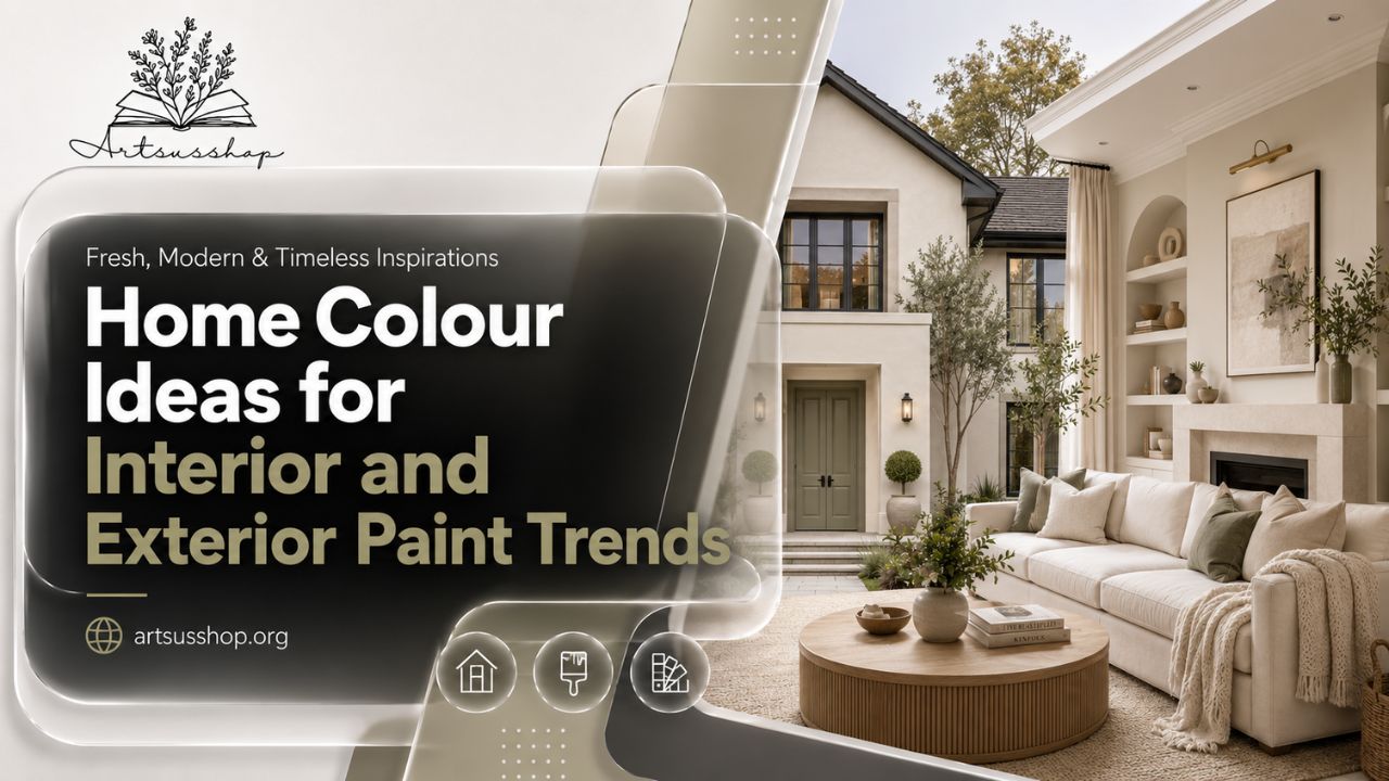
Choosing paint should feel exciting, but most homeowners know the opposite feeling: standing in front of hundreds of swatches, wondering why five “warm whites” all look different. The right home colour can make a small room feel open, a plain exterior feel expensive, and an older house feel freshly loved again.
Paint matters because it changes how your home feels before furniture, lighting, or decor even enter the room. A cozy beige can calm a busy living room. A deep green can give a front door character. A soft exterior neutral can make landscaping look sharper.
The tricky part is balance. You want a color that feels current, but not so trendy that you regret it next year. You want personality, but you also want a home that feels comfortable every morning when you wake up and every evening when you return.
Understanding Home Colour Before You Pick a Paint
A good paint decision starts with how you live, not with a random shade card. The best home colour choices support your home’s natural light, architecture, furniture, flooring, climate, and mood.
For interiors, color affects comfort at close range. You see it while cooking, relaxing, working, and hosting guests. For exteriors, color works from a distance, so roof tone, stonework, brick, trim, garage doors, and landscaping all influence the final result.
Warm, Cool, and Neutral Undertones
An undertone is the subtle color hiding beneath the main shade. A white can lean yellow, gray, pink, blue, or green. A beige can feel creamy and warm or dusty and flat.
That’s why a simple wall paint colour combination that looks perfect online may feel different in your room. Your flooring, daylight direction, and artificial lighting can shift the appearance.
Before choosing any color paint, tape large samples on different walls. Look at them in morning light, afternoon light, and at night. This one step prevents many expensive mistakes.
Why Color Looks Different in Every Home
North-facing rooms often make colors look cooler. South-facing rooms usually make colors brighter and warmer. Rooms with many trees outside may reflect green into the walls.
This is why professional painters and designers rarely approve a shade from a tiny chip alone. They test it in the real space.
A thoughtful home colour design respects these conditions instead of fighting them.
Simple Wall Paint Colour Combination Ideas That Work
A simple wall paint colour combination doesn’t have to be boring. In fact, simple palettes often look more expensive because they feel calm, intentional, and easy to live with.
The safest approach is to choose one main wall color, one trim color, and one accent color. This works beautifully in living rooms, bedrooms, hallways, kitchens, and open-plan spaces.
Soft Neutrals for Everyday Comfort
Warm whites, oatmeals, greiges, soft taupes, and mushroom tones are reliable because they pair with many furniture styles. They also photograph well and help small rooms feel less crowded.
A simple wall paint colour combination for a relaxed home could be warm ivory walls, crisp white trim, and muted olive accents. Another easy choice is pale greige walls, charcoal metal fixtures, and natural wood.
These combinations work because the colors don’t compete. They support texture, art, rugs, and furniture.
Two-Tone Walls Without Looking Busy
A two colour combination for walls can add structure to a plain room. You might paint the lower half in a deeper shade and the upper half in a lighter one, especially in dining rooms, kids’ rooms, stairways, and bedrooms.
A practical two colour combination for walls could be sage green below and warm white above. For a more modern look, try clay beige with off-white, dusty blue with cream, or charcoal with soft gray.
The secret is contrast control. If the two shades are too far apart, the wall can feel chopped in half. If they share similar undertones, the room feels more polished.
Living Room Color Ideas for a Welcoming Home
Your living room sets the emotional tone of the house. It’s where guests form their first impression, but it’s also where you unwind, watch TV, talk, and spend ordinary evenings.
That’s why living room color ideas should begin with comfort. A dramatic shade may look impressive in a photo, but you need to enjoy it in real life.
Calm Colors for Family Spaces
Soft beige, creamy white, pale gray-green, warm taupe, and muted blue are dependable living room color ideas for busy households. These colors let furniture and decor breathe while still giving the room personality.
If your living room has dark floors, use a lighter wall shade to balance the weight. If your furniture is very light, a medium wall tone can make the room feel grounded.
A good home colour choice should make the room feel better even before you decorate it.
Rich Colors for Character
Not every living room needs to be pale. Deep olive, smoky blue, warm terracotta, muted plum, and earthy brown can create a rich, cocoon-like atmosphere.
Benjamin Moore named Silhouette AF-655 its 2026 Color of the Year, describing it as a burnt umber shade with charcoal notes in a palette of pale and midtone colors. That kind of moody, refined color works well when balanced with soft lighting, textured fabrics, and lighter trim.
For homeowners who want bolder living room color ideas, start with one feature wall, built-ins, or a reading corner before painting the entire room.
Asian Paints Colour Combination With Code: How to Use Paint Codes Wisely
Many homeowners search for asian paints colour combination with code because paint codes make color selection feel more precise. Asian Paints lists shade names and numbers in its colour catalogue, including examples such as Air Breeze 9436, Button Rose 8108, Essence 8099, and Pink Mist 8092.
A code helps you identify a shade accurately, but it doesn’t guarantee the shade will look the same in every room. Screen brightness, wall texture, lighting, and nearby materials can change the final look.
Practical Interior Combinations With Codes
When using asian paints colour combination with code, think in groups rather than single colors. A soft neutral can be your main shade, a muted pastel can support it, and a deeper accent can add depth.
For example, a bedroom might use a pale warm shade on most walls, a dusty rose or misty blue on one wall, and white or cream on trim. A living room might pair a light beige with a deeper olive or clay accent.
A smart asian paints colour combination with code should also match your flooring. Marble, wood, gray tile, and terrazzo all change how color feels.
Don’t Skip Real Samples
The biggest mistake with asian paints colour combination with code is choosing only from a digital catalogue. Codes are useful, but real paint samples are better.
Paint a large sample board and move it around the room. Check it beside curtains, sofa fabric, cabinets, and flooring.
This process helps you turn a saved home colour design idea into something that works inside your actual home.
Home Colour Design for Interiors: Room-by-Room Planning
A strong home colour design feels connected from one room to the next. That doesn’t mean every room should be the same color. It means the colors should feel related.
If the entry is warm beige, the living room is sage, and the kitchen is creamy white, the palette can flow beautifully. If one room is icy gray, the next is orange beige, and the next is bright blue, the home may feel disconnected.
Bedrooms
Bedrooms usually benefit from restful shades. Soft green, muted blue, warm white, pale clay, dusty lavender, and beige-gray can all work.
For a bedroom simple wall paint colour combination, pair warm white with a muted accent behind the headboard. This gives the room depth without making it feel heavy.
A bedroom two colour combination for walls should feel soothing, not loud. Try cream with sage, taupe with ivory, or dusty blue with warm white.
Kitchens and Dining Areas
Kitchens have many fixed finishes: counters, cabinets, backsplash, flooring, appliances, and hardware. Paint should connect those surfaces.
A kitchen color paint choice should also handle brightness well because kitchens need good task lighting. Warm whites, soft greige, muted green, and pale clay often work better than stark white.
Dining areas can handle deeper colors because people usually use them in softer evening light. Rich brown, muted burgundy, olive, and smoky blue can make dining feel intimate.
Hallways and Open Plans
Hallways need colors that transition easily. If you’re unsure, use a warm neutral and add personality through art, lighting, and trim.
In open plans, repeat at least one color family across connected spaces. A calm home colour palette makes the whole house feel larger and more intentional.
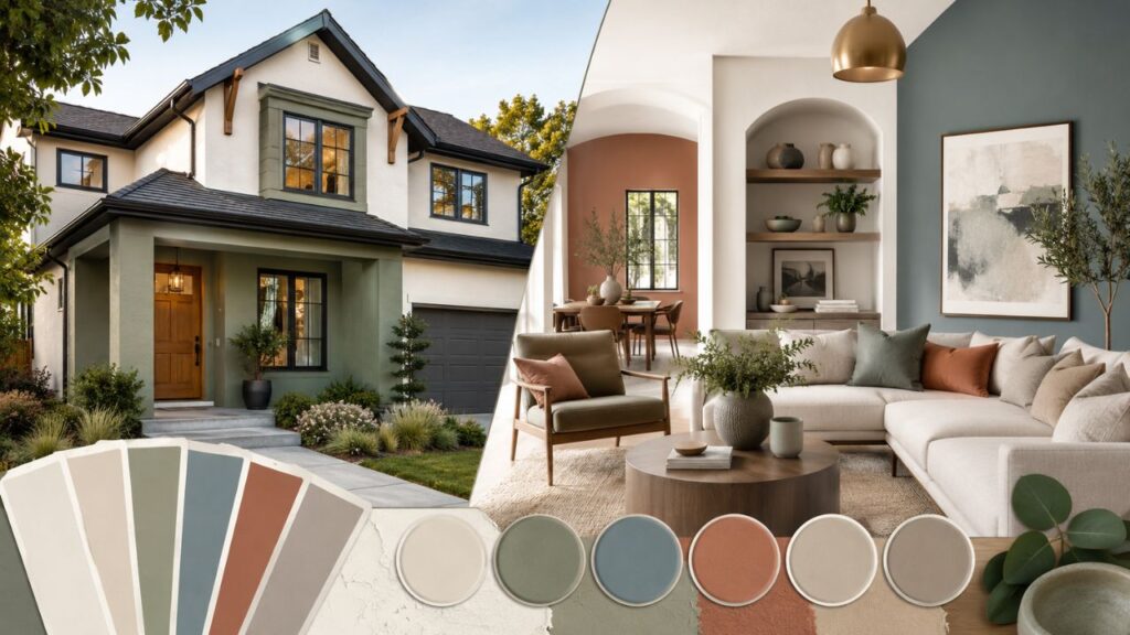
Exterior House Paint: What Matters Before Color
Choosing exterior house paint is more complicated than choosing an interior shade. Exterior color must work with sunlight, weather, roofing, masonry, landscaping, neighborhood style, and resale expectations.
A color that looks soft indoors can look washed out outside. A shade that looks elegant on a small sample can look much stronger across a full facade.
Read the Fixed Elements First
Before choosing exterior house paint, study the permanent or expensive elements you won’t change soon. These include the roof, stone, brick, driveway, fencing, gutters, windows, and front steps.
A gray roof may suit cool neutrals, blues, and crisp whites. A brown roof usually works better with cream, taupe, olive, tan, or warm white. Red brick often needs careful pairing because it already carries strong color.
Your exterior house colors should support these fixed materials instead of competing with them.
Climate and Sun Exposure
Bright sunlight makes colors appear lighter. Shaded homes can make colors appear darker and cooler. Coastal homes may suit breezy whites and blues, while wooded homes often look better with greens, browns, and warm neutrals.
This is why exterior house paint colors should always be tested outside. Paint sample boards and view them from the street, driveway, and sidewalk.
A reliable best exterior paint choice is not only about the shade. It’s also about durability, surface prep, primer, finish, and weather resistance.
Exterior Paint Colors and House Colors for Curb Appeal
The right exterior paint colors can make a home look cleaner, newer, and better proportioned. The wrong ones can make even an expensive renovation feel unfinished.
Most successful house colors follow a three-part structure: body color, trim color, and accent color. The body covers the largest area, the trim frames the architecture, and the accent highlights doors, shutters, or small details.
Classic Exterior Palettes
Some exterior house colors stay popular because they work on many home styles. White with black trim, warm beige with cream trim, gray-green with off-white, and taupe with dark bronze all feel dependable.
If you want safer house colors, choose a main shade that relates to the roof and landscape. Then add contrast through trim and the front door.
For example, a warm greige body with white trim and a deep green door can feel classic without looking dull.
Modern Exterior Palettes
Modern house colors often lean cleaner and more architectural. Think warm white with black windows, charcoal with natural wood, soft taupe with bronze trim, or muted green with stone accents.
Sherwin-Williams selected Universal Khaki SW 6150 as its 2026 Color of the Year, calling it an essential neutral chosen for livability and longevity. That kind of grounded neutral fits many modern house colors because it feels softer than stark gray but still refined.
If you’re reviewing sherwin williams exterior paint colors, compare warm neutrals, muted greens, creamy whites, and charcoal accents before committing.
Sherwin Williams Exterior Paint Colors and 2026 Trends
Many homeowners search for sherwin williams exterior paint colors because the brand offers a wide range of exterior options and color tools. Sherwin-Williams states that it has more than 1,700 paint colors, which gives homeowners plenty of room to find a precise match.
The challenge is narrowing the choices. A wall of swatches can be helpful, but it can also overwhelm you.
Grounded Neutrals Are Replacing Cold Grays
For 2026, the broader direction is warmer, earthier, and more personal. Sherwin-Williams’ 2026 collection through HGTV Home includes Universal Khaki, Griffin, Cordovan, Reddened Earth, Still Water, and other shades under its Honest Essentials collection.
That matters because 2026 exterior house colors are moving away from flat builder gray. Homeowners still want sophistication, but they also want warmth.
A practical sherwin williams exterior paint colors palette might use a khaki body, creamy trim, and deep bronze accents. Another option could use a green-gray body with warm white trim and a stained wood door.
Where Bold Colors Belong
Bold shades work best when they have a clear role. Use them on doors, shutters, porch ceilings, or small architectural details.
If you want bolder exterior paint colors, keep the main body calmer. That way the home feels intentional rather than loud.
The same rule applies to modern exterior house paint colors photo gallery inspiration. A photo may show a dramatic black house, but your lot, climate, roofline, and neighborhood may need a softer version.
Modern Exterior House Paint Colors Photo Gallery: How to Read Inspiration Photos
A modern exterior house paint colors photo gallery can be incredibly helpful, but only if you know how to study it. Don’t just ask, “Do I like this?” Ask, “Why does this work?”
Look at the roof color, window color, trim width, landscaping, walkway, garage door, and natural light. A paint scheme that looks perfect on a desert modern home may not suit a shaded colonial in the Midwest.
Match the Palette to the Architecture
Ranch homes often look great with earthy exterior house colors, natural wood, and strong trim contrast. Craftsman homes usually suit greens, browns, creams, and deep reds. Modern farmhouse homes often use white, black, warm gray, and wood.
When saving images from a modern exterior house paint colors photo gallery, choose homes with a similar roofline, siding type, and setting. That makes the inspiration more useful.
The best modern exterior house paint colors photo gallery examples show balance. They don’t rely on paint alone; they combine color with texture, materials, lighting, and landscaping.
Use Photos as Direction, Not Final Proof
Photos can lie. Editing, shadows, camera settings, and screen brightness all affect color.
Use a modern exterior house paint colors photo gallery to narrow your taste, then test real samples on your home. Place samples near trim, stone, brick, and the garage door.
If you’re torn between several exterior house paint colors, view them at different times of day before choosing.
2026 Exterior House Colors: What Looks Fresh Now
The most livable 2026 exterior house colors feel grounded, warm, and connected to nature. Expect to see more khaki, clay, olive, mushroom, deep green, warm white, bronze, and blue-green.
Behr named Hidden Gem its 2026 Exterior Color of the Year, describing it as a blue-green tone that adds contrast against lighter materials like whitewashed brick or stone and pairs with darker metals and wood.
Warm Whites and Soft Earth Tones
Warm white is still one of the safest exterior paint colors, but it now feels better when paired with natural accents. Wood doors, bronze fixtures, stone walkways, and warm landscaping keep white from feeling sterile.
Soft earth tones are also strong 2026 exterior house colors because they age well. Khaki, mushroom, clay, and green-gray can make a home feel updated without shouting.
These house colors work especially well on homes with black windows, stone accents, or mature landscaping.
Blue-Greens and Muted Greens
Muted green has become a serious exterior contender. It connects a house to trees, grass, and garden beds while still feeling polished.
Blue-green shades can look modern on coastal homes, farmhouses, cottages, and contemporary facades. They also pair beautifully with off-white trim, dark metal, and warm wood.
For anyone comparing modern exterior house paint colors photo gallery ideas, green-based palettes are worth saving.
Best Exterior Paint Choices: Finish, Durability, and Prep
The best exterior paint is not just the prettiest color. It’s the product and finish that suit your siding, climate, sun exposure, and maintenance expectations.
A premium paint can still fail if the surface is dirty, chalky, damp, or poorly primed. Prep matters more than most homeowners expect.
Finish Matters
Flat finishes hide imperfections but can collect dirt. Satin finishes are popular for siding because they offer a subtle sheen and better cleanability. Semi-gloss works well for trim and doors because it highlights details and resists wear.
If you’re choosing exterior house paint, ask what finish suits your material: wood, fiber cement, stucco, brick, vinyl, or metal. Each surface behaves differently.
The best exterior paint choice should also consider UV exposure, moisture, mildew resistance, and local weather.
Don’t Forget Trim and Doors
Trim can sharpen or soften the whole exterior. White trim feels classic, cream trim feels warmer, black trim feels graphic, and bronze trim feels modern.
Front doors allow more personality. A deep green, navy, burgundy, black, or terracotta door can turn ordinary exterior house colors into a memorable facade.
A polished exterior usually combines the right body shade, trim shade, door color, and finish. That’s where a full home colour design plan becomes more useful than choosing one shade at a time.
Practical Paint Combination Examples for Real Homes
It helps to see how combinations work together. These examples can guide your first round of samples.
For a calm living room, try warm white walls, taupe trim, and olive accents. This simple wall paint colour combination feels relaxed but not plain.
For a stylish bedroom, use cream walls with a muted blue headboard wall. This two colour combination for walls gives depth without making the room dark.
For a modern exterior, try khaki siding, off-white trim, black windows, and a stained wood door. This fits many modern house colors while still feeling warm.
For a bold exterior, use blue-green siding, white trim, charcoal metal details, and natural landscaping. This works well for homeowners exploring 2026 exterior house colors with more personality.
For a South Asian-inspired interior, use an asian paints colour combination with code as a starting point, then sample the colors in your real room before finalizing.
For a resale-friendly home, choose balanced house colors: warm neutral walls inside, timeless trim, and clean exterior contrast outside.
Frequently Asked Questions
How do I choose a home colour when every sample looks different?
Start by identifying your fixed finishes: flooring, cabinets, roof, brick, stone, and furniture. Then test large samples in real light for at least two days before choosing your final color paint.
What is the safest wall color for a small room?
Warm white, soft greige, pale beige, and muted green are safe choices for most small rooms. They reflect light without feeling cold and work with many furniture styles.
Should interior and exterior colors match?
They don’t need to match exactly, but they should feel related. If your interior palette is warm and earthy, your exterior will usually feel more natural with warm exterior house colors instead of icy tones.
What colors make a house look expensive?
Layered neutrals often look expensive: warm white, taupe, charcoal, olive, bronze, and natural wood. Clean contrast and good trim color matter more than using a trendy shade.
How many colors should I use on my exterior?
Most homes look best with three main colors: body, trim, and accent. Larger homes with stone, brick, shutters, or multiple materials may need a more detailed palette.
Is dark exterior paint a bad idea?
Dark paint can look stunning, but it absorbs more heat and may show fading or dust faster in some climates. Use high-quality paint, test the shade outside, and consider dark colors for accents if a full dark exterior feels risky.
Can I use the same paint color in every room?
You can, especially in open-plan homes, but vary the mood through lighting, furniture, rugs, and accent walls. A single neutral throughout the house can feel elegant when the undertone is right.
How do I compare Asian Paints and Sherwin-Williams colors?
Compare undertones, not just names or online images. Use real samples when possible because different brands have different bases, finishes, and color systems.
Final Thoughts on Choosing a Home Colour You’ll Love
A beautiful home colour plan doesn’t come from guessing. It comes from studying your light, respecting your fixed materials, testing samples, and choosing colors that match how you actually live.
Trends can be helpful, especially when they point toward warmer neutrals, richer earth tones, and more personal exteriors. But your best palette should still feel right in your own home, on your own street, and in your own daily routine.
Paint is one of the most powerful changes you can make without rebuilding your house. When the colors work together, your home feels calmer, sharper, warmer, and more complete every time you walk through the door.